
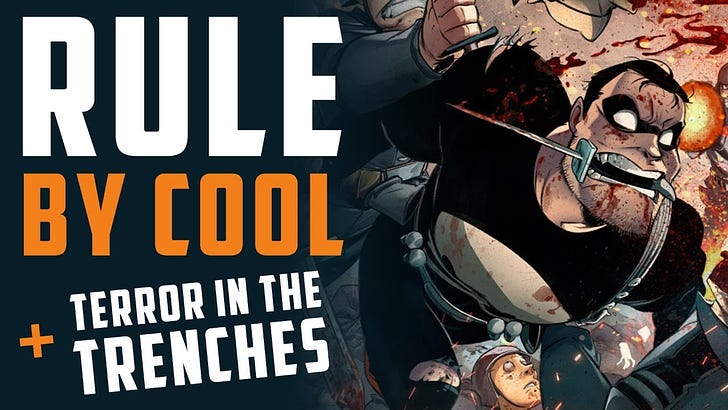
1 Week into TERROR
1 Week into TERROR
My first week on the campaign trail!

Greeting fiends,
1 week into terror and while I’m tired as it gets I’m also full of energy. The response has been nothing short of amazing. We doubled what my first book (Monster M.D.) did in a single day. We’ve neared 35K in a week! The support I’ve received has been nothing short of astounding. I’ve been on many shows with the awesome people of #Comicsgate and having a blast.
I learned so much from doing my Monster M.D. campaign and it definitely made this terror campaign next level. But the work was intense as a one man show. Here are some tips on how I do my campaigns.
I’m about light graphics and letting the ART do the talking.
We open with our opening paragraph. This time I opted for a simple line to also draw people in. I would have preferred the paragraph be shorter cause the idea is we hook with a few sentences then hit them again quickly with the art. Comics are for art and story lovers. They’re a visual enthusiast medium - SHOW THE ART and be bold with it. Let people see entire pages and many of them. As long as there isn’t dialogue on the pages the audience won’t feel spoiled.
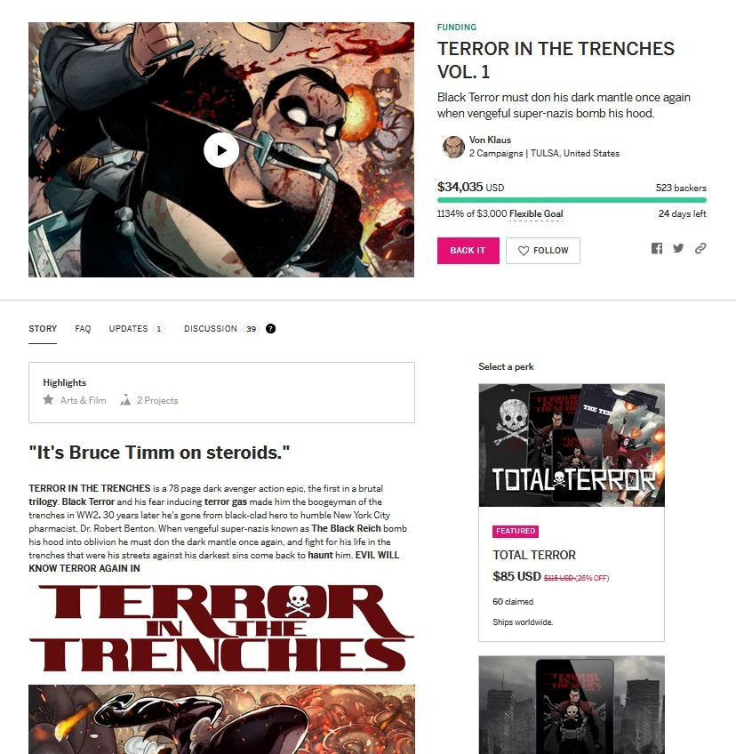
I show more art than most campaigns, and I’m proud of it. I’m not a name in comics. Just a guy trying to show you what’s up so that’s how I do it.
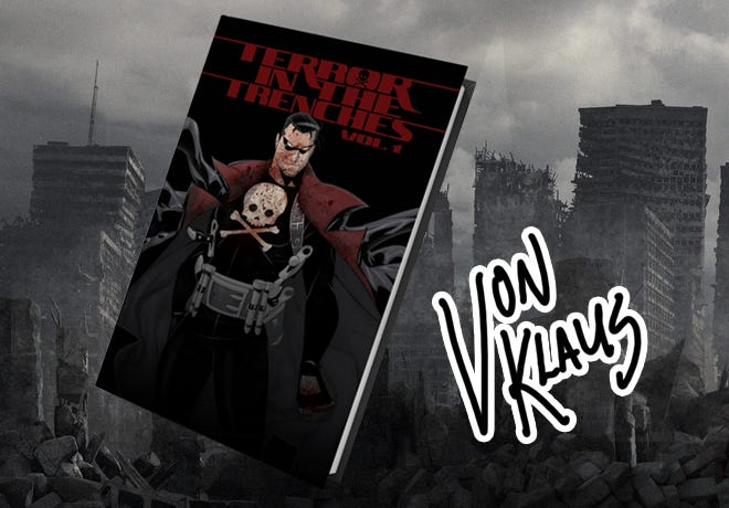
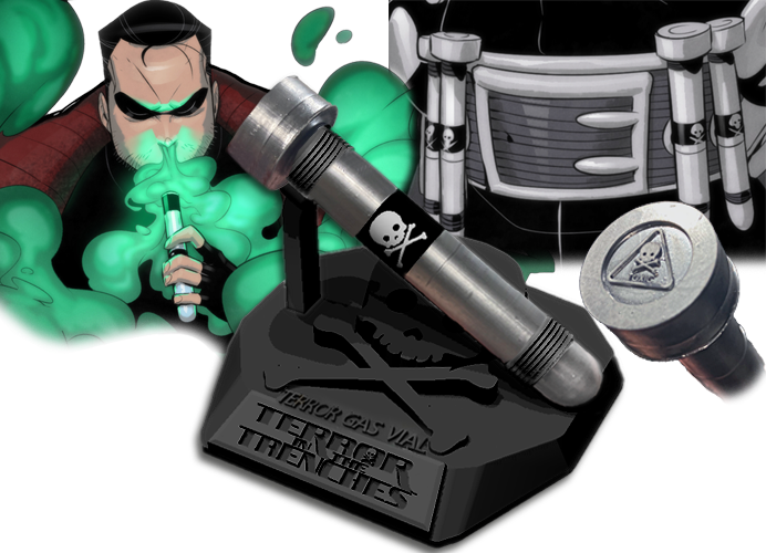
For my perks I like to see the items and have a cool background that relates to the story. Keep clean and simple. Show people what they’re buying. I added my sig to let everyone know you get that with the book.
For the larger perks I’ll drop in some text to show that they’re special without taking away too much from the products.
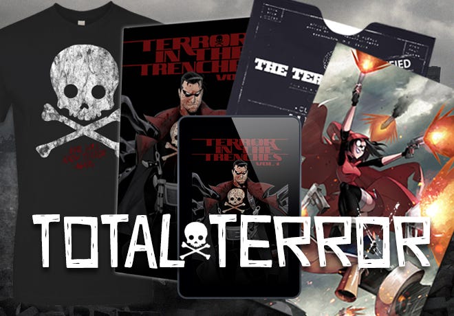
Get them excited with the art. On all my books I’ll have my artists do ACTION pages later in the book to show off how cool the entire story is.
Keep it simple, kiddo
Showcase actual products on WHITE. Avoid over the top graphics and boxes and all that distraction. Keep it simple and show your potential customers what you’re offering in a cool clean way they can immediately understand.
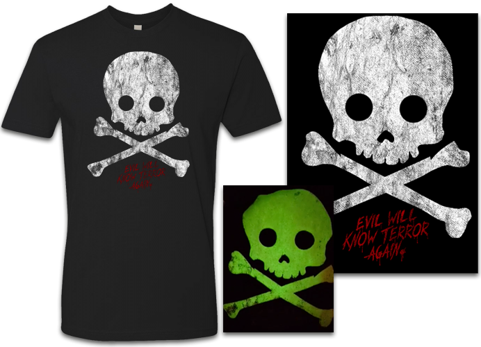
Campaigns should be FUN and easy to understand. Direct, clean design will never fail you.
A killer trailer
I’m proud that so many people are telling me this is the best trailer they’ve ever seen for an indie book. Thank you all! But guess what?! It’s not as hard as you think to make.
Download the app CapCut for iphone and android. Learn it, live it, love it. I brought panels into it from my book and used the 3Dpro effect to make beautiful 3D animation clips. I then uploaded those clips to my desktop and edited them into a killer trailer with the music. Music by my royal court musician VOSTO!
My trailer may make me look like Scorsese but I’m really just Ed Wood.
Keep the language fun and sparse
The copy on my campaigns is explaining things clearly. This is what a block of info showcasing a product looks like:
Simple explanation with art credits. DONE. Explain it quick and in a cool succinct way and move on. Study other campaigns and even regular products outside of comics and ask yourself how to achieve engaging language that makes people want what you’re selling.
I can’t believe it, but that’s it? I mean the work I put in is insane and takes forever but the end result is what many call a near perfect campaign for a comic. Copy me all you can and it may help your campaigns in some ways, but if something else works for you I recommend doing that instead. You don’t have to do it my way.
See you in the trenches!
Your fiend in comics,
- Vonster